
Log Analytics: Improved rendering of Charts
Hi all,
I just found out today that the Render operator now supports more features in Log Analytics.
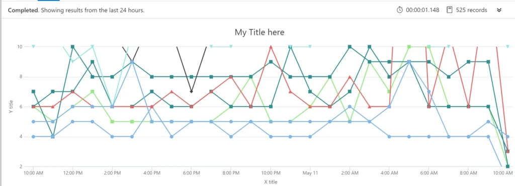
Event
| summarize dcount(EventID) by Computer , bin(TimeGenerated, 1h)
| render timechart with (legend = hidden, title = “My Title here”, xtitle = “X title”, ytitle = “Y title”, ymin = 3, ymax = 10)
# Note: previously you could only set a Title in Log Analytics
Now you can set X and Y axis names, and values ! Thanks Dan for the tip!