Org charts are like maps of the workplace.
But they don’t tell the full story.
New data-powered visualizations offer a surprising glimpse into collaboration patterns.
Intelligence
Microsoft researchers used machine learning to find out how collaboration happens—beyond the org chart
How do we really work together?
An org chart tells the official story of how an organization is structured, but that portrait of rank and hierarchy is only a partial, simplified view of how people and teams work together. The truth about collaboration lies deeper than those interlinked circles and squares.
For a recent project, Jonathan Larson and Darren Edge of Microsoft Research used machine learning to go granular on how workers actually connect and communicate. The researchers focused in on a subset of Microsoft employees and leveraged aggregated metadata—de-identified emails, Microsoft Teams communications, calls, and meetings—to paint a vibrant picture of workplace behavior that doesn’t always align with official organizational structures. 1
These 3D animations are a map of a new world, a previously undiscovered territory with a surprising topography—and new machine learning methods enabled the researchers to build these maps and explore this terrain. What draws colleagues together, it turns out, isn’t necessarily job title or department or even time zone. In today’s limber workplace environment, teams that form and disband quickly around given projects have become critical to getting work done.
For leaders, the findings provide an opportunity to re-chart their thinking on work structure and perhaps allay some fear. After more than two years of remote and hybrid work, communication is still thriving—although sometimes it’s really useful for a team to work autonomously, as a pod apart. And in a hybrid workscape, “where you are” and “what you do” may not matter as much as having a broad network that fuels career opportunities within a company.
The visualizations bring a form of radical transparency to how orgs function, says organizational psychologist Constance Noonan Hadley, founder of the Institute for Life at Work and a consulting researcher at Microsoft Research Lab. “You can really see communication patterns across thousands of people in a way that we could never do before,” Hadley says. “And that is fundamentally extremely exciting.”
Such data, applied properly, could help leaders identify hidden gems, like teams whose connections are strongest across an organization, says Hadley, who was not involved in this research. It might also help the C-suite spot collaborations that need nurturing, or evaluate when reorgs and mergers are working well—or not.
In short, knowing how orgs actually organize might enable business leaders to make smarter decisions about team architecture, staffing, and leadership—especially when they need to make the most of their resources—because people don’t always communicate along predictable lines.
Let’s explore the findings.
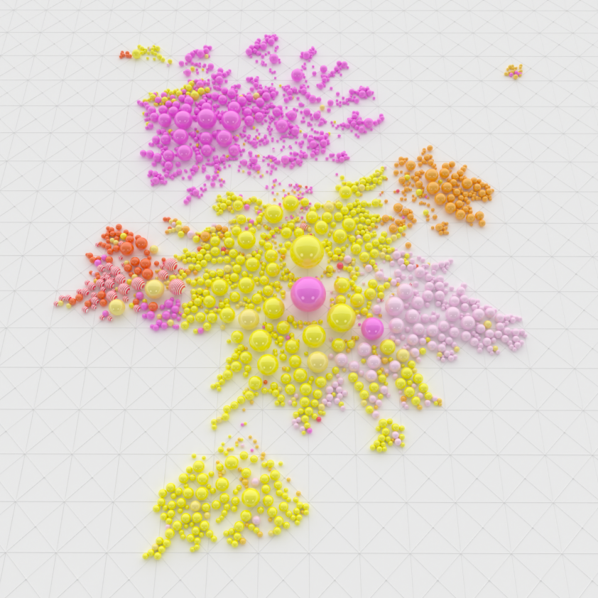
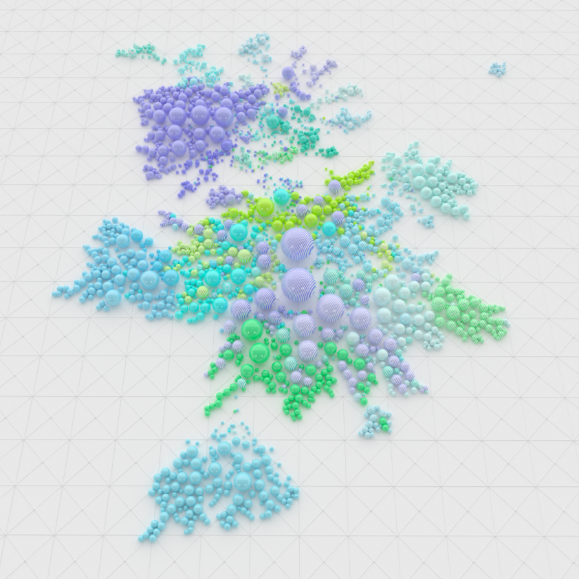
Unlike a traditional org chart that groups employees based on department and rank, the network map above takes into account how closely people actually work together.
Larson and Edge analyzed people’s communications signals—a combination of anonymized emails, meetings, and Microsoft Teams chats—then used machine learning to plot employees onto the network map. This particular chart shows communication patterns for October 2021.
How it works: Each dot, or node, represents a person. People are placed near each other if the signals show they have frequent, meaningful communications with one another. In other words, the signals suggest these people collaborate closely.
Large dots represent employees who have meaningful communications with a wide number of people. The people closest to the center of the map are communicating most often with the greatest number of employees across the organization. This is where your leaders are likely to be.
Let’s focus on one large group of Microsoft researchers, as seen in red in the animation above. By its strong presence near the center of the network map of US-based Microsoft employees, we can tell this research group is integral to the company as a whole, but we can also see little groups scattered across the network who work closely with different teams.
“This research group is expected to do work that touches all of Microsoft, and so you’d hope to see that it collaborates with people across the company,” says Larson, co-author of the research and a principal data architect at Microsoft. “That’s exactly what the data is showing us.”
So far, no big surprises. Watch what happens when you take a deeper dive into the findings.
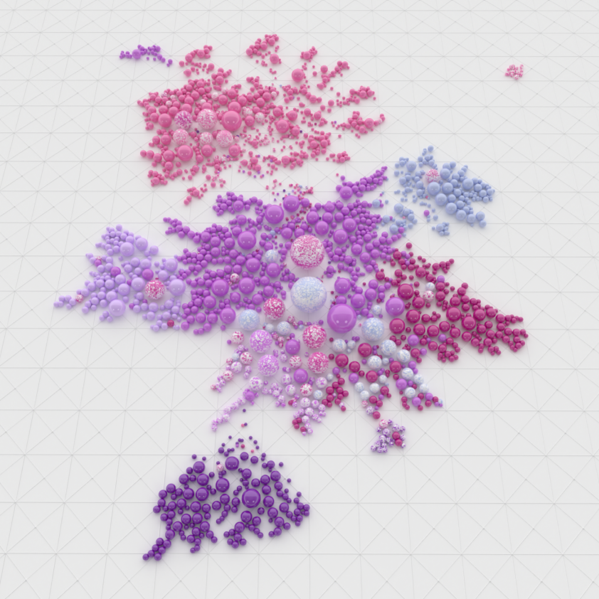
In this map, each color corresponds to a location—where team members are based. Yellow dots represent people in one region, and orange signifies employees in a different location. What does it mean when many colors are clustered closely together? That’s a sign of intense communication between people in different places.
The three maps in the chart above all represent different views of the same research group. Larson and Edge looked at the group’s communication patterns through three different lenses—one that sorts people by their location; another that groups people based on which executive they report to; and one that categorizes communities based purely on insights from machine learning to detect communities of people who work closely together, regardless of team or location.
Notice the isolated “island” that appears near the bottom of each of the maps. That’s a group of workers who are based in the same location, report to the same executive—and operate almost entirely on their own. It’s up to leadership to determine whether that autonomy is useful or cause for concern, based on the goals of the project the group is working on.
“If that group is working autonomously to build an important piece of the business without being bothered by endless outside meetings, that might be a healthy sign,” Larson says. “But if that’s not the case, it’s on the group’s leader to pull them back in and encourage them to collaborate more. This data gives you the tools to make those larger decisions.”
When you start comparing these maps, rich and actionable insights emerge—about whether the formal org chart aligns with the reality of how people collaborate, for example.
As Larson and Edge looked closer, new revelations appeared.
One example: Communications signals revealed an intense collaboration bridging several labs in different geographic locations. These teams are in different cities but actually function as one—showing how collaborations can succeed irrespective of the geographic borders between teams. These kinds of insights give leaders opportunities to fine-tune strategy.
“You can figure out what those teams are doing right to actually make collaboration work, and then apply it elsewhere in the organization,” Larson says. In other words, the network maps point out where the collaboration is happening successfully, and then leaders can do more digging on why that is. Is there a strong leader who bridges divides? Or perhaps a shared sense of culture and tradition?
In another case, Larson and Edge zeroed in on communication patterns between a group of employees who all report to the same executive. What the data revealed: That team actually operates as two separate entities. In other words, one leader has a team that is effectively two teams.
“Machine learning pulled out information that was not encoded in the actual org hierarchy,” Larson says. "The data uncovers the reality of informal communication patterns."
What else can leaders do with all this fascinating data?
In the future, these kinds of visualizations could be used to see how well a reorg is working out, as shown in the animation above. Or companies could use machine learning to evaluate a merger: Do organizations meld the way they are meant to?
It’s one thing to wait for profit reports or divisional output after these kinds of changes. But here we see instantly whether employees are working in important new ways or clinging to old systems. This data-driven view of an organization could one day give companies the ability to make better decisions about everything from coordinating flexible work schedules and new hires to laying out office floor plans.
“It’s like the difference between using a paper atlas and an online mapping system,” Larson says. “We’re getting a new, data-driven look at how teams function within an organization, how they communicate and interact—and that informs much better decision-making about what’s next.”
A note on privacy: Trust and privacy are fundamental at Microsoft. For this analysis, data was aggregated to prevent individuals from being identified.