I am very excited to announce that canvas components are now available in production as an experimental feature!
Canvas components make it easier to build reusable controls, such as navigation menus and dialogs. The ‘master’ / ‘instance’ behavior makes it easy to reuse them as building blocks inside the app or shared between apps.
Why components?
You’ve been through this before: you create a useful group of controls like a header. Then you copy and paste it on each screen of your app where it’s needed. But if you wanted to update any part of your controls, such as an icon, a formula, or a even one color, you would need to make that same change to every copy.
That’s a lot of small edits that can add up to a significant task.
So we’re excited to announce the experimental Components feature to make this experience easier.

What are components?
Components are reusable building blocks for canvas apps. You can define a set of controls to reuse inside an app. You could import a component into other apps as well. They behave in a master-instance manner, meaning that any updates you make to the original (‘master-instance’) will apply to other copies in the same app.
So think of a header for your app: you create it once and if you were to change its text, that change would be reflected across each instance within the app.
Below is a clip introducing components including some of the terminology to know.
Advanced customization
Not only can you reuse a set of controls, but you can also define more advanced behaviors with custom properties.
Today, controls have properties such as Fill, Color, Height, Width, etc. out of the box. When you create your own component, you can invent your own properties of every data type: value, text, record, and table to name a few.
What you can do with custom properties is only limited by your imagination.
More experienced makers will want to make controls inside of a component shrink and expand as it is resized. Relative positioning and sizing are best practices now as they have been before this feature.
Getting Started
Components are now available as an experimental feature. Follow these steps to get started.
- Open the PowerApps Studio.
- Go to App settings > Advanced settings.
- Turn on “Components” in Experimental features.
- In the Tree View, select “Components” and you will land on a square canvas.
Import and Export a Component
One effective way of learning a new skill is to see how others have done it. You can watch the video below on how to create your own Header component.
You can also download and walk through the sample header used in the video.
- Download this msapp file for a Header Component.
- Start a new blank app in PowerApps.
- Click Insert > Components > Import component > Browse for the .msapp file.
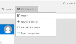
- The component will appear on the dropdown menu for inserting components.
- Click Insert > Components > Header to insert the header.
Making App Building Easier
In this first release of components, please take the time to know its current limitations. You can read the
full documentation for more details.
- Instance: a master-instance of a component is scoped to the app. It is a local master. This means that changes you make to the master-instance only affect the copies of the component within the app. The changes do not affect the copies in other apps.
- Images: it is not yet possible to package media files when importing a component, but this feature is coming soon.
- Collections: using Collect within a component is not yet fully supported.
- Data sources: data sources are not saved with components.
This experimental feature is a step towards better reusability and scalability for more complex apps and distributed app building. The development effort is continuing, and more capabilities are on the way.
Resources
Feature Documentation
Video: Introduction
Video: Header Component