Announcing the general availability of the new model-driven form designer
Today we are happy to announce that the new model-driven form designer is out of preview and available for general use. Few months back, we had started on the journey of providing a new form designer that helps take your form authoring experience to the next level. Over that period, so many of you have actively used the new form designer and given us great, actionable feedback, thank you! All that feedback has helped us provide new features and updates in the form designer that meet your needs and boosts your productivity.
The new form designer enables makers to productively author main, quick view and quick create forms. It provides a WYSIWYG preview that shows exactly how the form will look like to end-users at all times. The fields pane with searching and filtering capabilities helps makers quickly find and add fields to the form. The components pane makes it easy to discover and use components and provide a rich end-user experience.
Using drag-drop or cut-paste directly on the form preview, makers can add and move fields and components, to the exact location they want. An always available property pane makes the common task of updating properties quick and easy. Updates to properties are also instantly reflected in the form preview. The tree view helps visualize the hierarchy of the form’s fields and components and to quickly find and select a field or component on the form.
The new form designer also has built-in error reporting and telemetry infrastructure to help us actively track and respond to direct as well as indirect issues that makers may be facing.
New features in this release
Here are some new features that have been added with the recent release.
Easily discover and add components to the form
Using the classic form designer, makers had to first add a field to the form and then dig through the properties dialog to find and add components to the form.
With the new form designer, components are listed upfront in the components pane and maker can easily discover and add components to their forms.
- In the Components pane, search or scroll to find the component that you want to add. You can hover over a component in the list to see a preview image, description and other details of that component.
- Drag-drop or select a component to add it to the form.
- In the property dialog configure all the required properties of the component and then select Done.
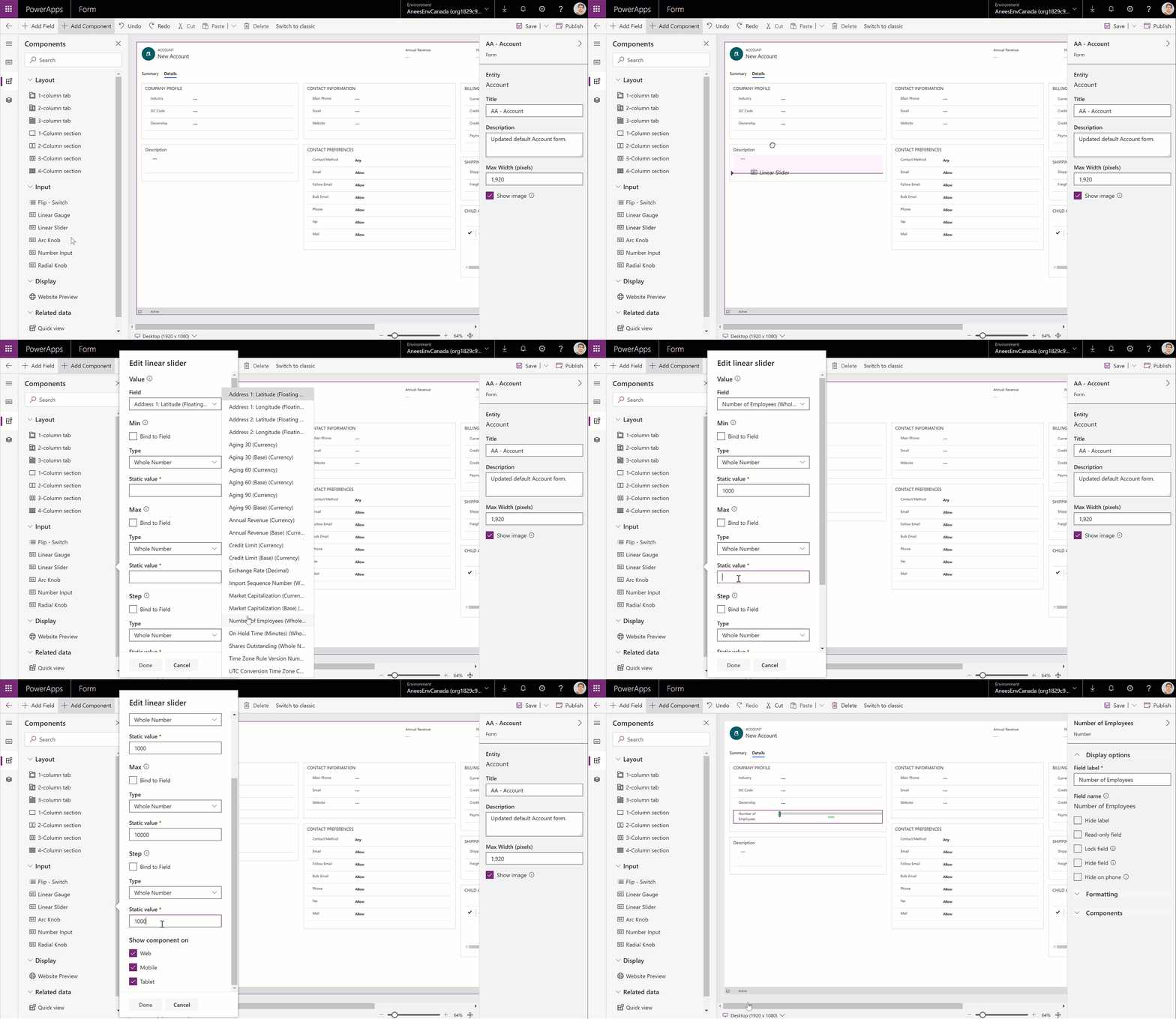
For detailed steps, please see: Add, configure, move, or delete components on a form.
The new form designer currently supports a limited set of components with support for more coming in the future.
Add components to a field
Makers can also add components to existing fields on their form via the property pane. When adding components to a field the list of components is filtered to only show the components that are compatible with the current field type.
- Select a field on the form.
- In the property pane, under the Components area, select + Component. The Add component dialog will display a list of components that are available for the current field type. You can hover over a component in the list to see a preview image, description and other details of that component.
- In the Add component dialog, search or scroll to find the component you want to add and then select it.
- In the property dialog configure all the required properties of the component and then select Done.
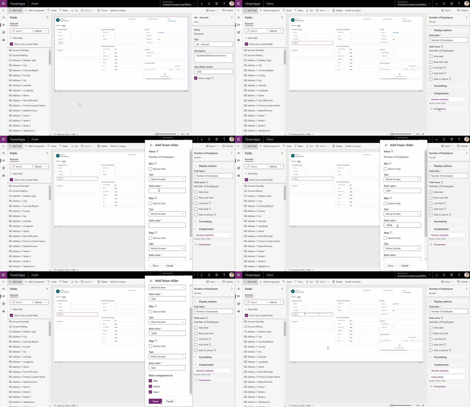
For detailed steps, please see: Add components for a field on the form.
Add and configure a sub-grid component
Makers can now add and configure the sub-grid component using the new form designer. The properties of the sub-grid component are presented in a simplified and easy to understand manner and the designer also shows a preview of the sub-grid component.
- In the Components pane, search or scroll to find the Sub-grid component.
- Drag-drop or select it to add it to the form.
- In the property dialog configure all the required properties then select Done.

For details, please see: Add and configure a sub-grid component on a form.
Add and configure a quick view component
Like the sub-grid, makers can also add and configure the quick view component using the new form designer. The form designer displays a preview of the quick view form that the quick view component uses.
- In the Components pane, search or scroll to find the Quick view component.
- Drag-drop or select it to add it to the form.
- In the property dialog, select a lookup field and at least one quick view form and then select Done.
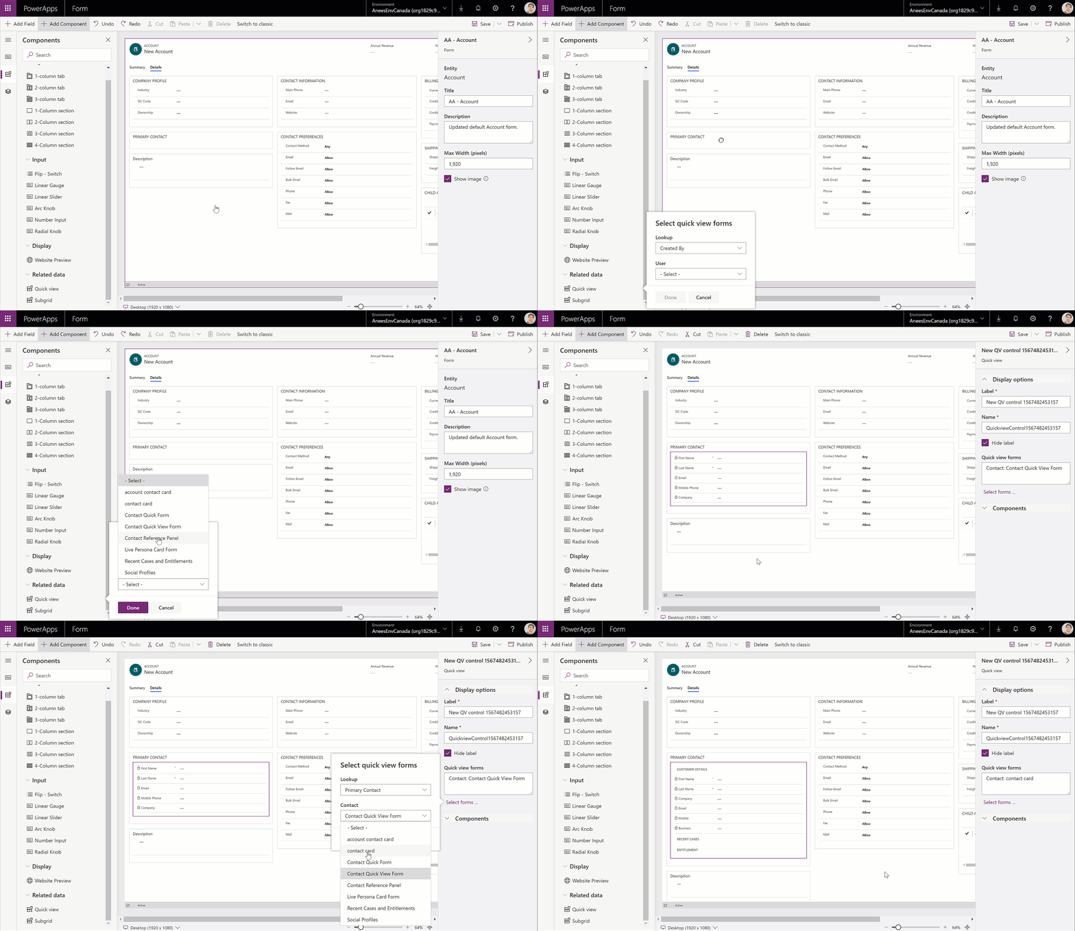
For details, please see: Add and configure a quick view component on a form.
Configure a lookup component
The new form designer also supports configuring the popular lookup component. Like the sub-grid, the properties of the lookup component are also presented in a simplified and easy to understand manner.

For details, please see: Configure a lookup component on a form.
Create a new field on the entity while editing a form
When using the classic form designer, creating a field on the entity was done via a separate pop-up window, forcing makers to switch context. The newly created field also did not appear in the list of fields until the form designer was re-opened or refreshed. This led to a negative impact on the authoring experience and productivity.
Using the new form designer, makers can create new fields on the entity from within the form designer, without switching context, using a dialog. The newly created field also instantly appears in fields pane. This helps makers be productive and focus on the primary task of editing the form.
- In the Fields pane, select + New field.
- In the New field dialog, provide the Display name and Name for the field.
- In the New field dialog, select the Data type and configure any other required properties of the field.
- Click on the Done button to create a new field on the entity. The field will be created and appear in the Fields pane.
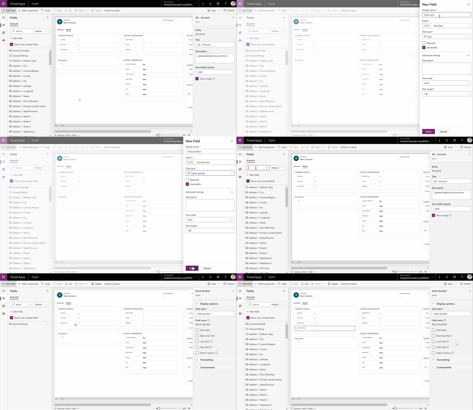
For detailed steps, please see: Create a new field on the entity when editing a form.
Get started today!
If you have not yet tried the new model-driven form designer, try it out today. To help you get started quickly, we have lots of documentation here: Overview of the model-driven form designer. Remember to check out all the related sub-topics.
To everyone who has been using the new model-driven form designer and giving us feedback, thank you once again for being a part of this journey with us. We hope the new designer helps you be more productive and efficient. This is not the end of the journey by any means. We look forward to keeping the collaboration going and delivering many additional features that enhance your authoring experience.


