Giving Consumers Color and Text Size Configuration Options
One of my favorite things about PowerApps is the way it helps me (as an app designer) to combine best practices in ‘design’ with ‘technical functionality’. Bringing these two factors together strengthens the probability that people who use the apps I’ve created, will actually ‘enjoy’ using them. This week’s app sample was inspired by someone who posted a Forum Idea regarding PowerApp Themes. We really enjoy reading all the forum ideas, and I refer to those who post ideas as our enthusiastic “innovators”. This particular innovator came up with the idea that we should expose our color themes to the consumer of the app (aka the person running the app), and not only to the designer (or app maker). What an awesome idea! It shows that they appreciate Empathic Design. Empathic Design is a process that one of my past managers (Karuana Gatimu) has instilled in me. It is a user-centered design approach that pays attention to the user’s feelings toward a product. As I thought about this further, I realized that this is even more relevant in mobile app design because factors around mobility can affect the way we use contrast and color on the screen; low light, screen glare, etc. (depending on where the person is when they are running the app). It also could apply to accessibility, especially for people like me who always want to make the font size bigger! So, with all those good reasons in mind, I decided to see if I could create my own configurable theme, using the features and formulas that are already in PowerApps today. I love what I ended up with, and I hope you will too!
Example Business Scenario:
Image that we need to create a knowledge management app. People will use the app to look up information, and to get examples of how to build contract specifications, based on the category of work to be done. Due to the advanced speed to delivery, we decide to create a PowerApp, and to publish it to the entire organization. Our PowerApp will be used by internal staff within a web browser, and by field representatives using iOS, Android, or Windows Phones externally. Since our field representatives often work outside with Surveyors, we’d like to make our apps friendly for outside use as well, where contrast is a priority. Therefore, we decide to give the end user the option of viewing the PowerApp in full color or in greyscale, or to invert the palette to a monotone white text on a black background format.
Here’s a peak at how it will work. The app consumer will tap on the tools icon (on the right hand side of the header) to open a menu of display options. They can put them away by tapping the tools icon again.

…and here’s how you do it!
1. Preparing our Style Selections and Default Values
We plan to use 5 variables that represent colors and standard text size. You can use more, or less, depending on the complexity of your screens.
· HText (Header/Button Text Color) – Defaulted to White
· HBack (Header/Button Background Color) – Defaulted to ColorValue(“#DA4453”)
· SBack (Screen Background Color) – Defaulted to White
· ForeTT (Text Color) – Defaulted to Black
· FSize (Font Size – Page and Gallery Text) – Defaulted at 18
Use the OnVisible* Property of the 1st Screen to set default values I am using a “Collection” for my color settings, and a Context Variable for the font size, just to show you another variable option. FYI: I set the OnVisible property of the 1st screen to update all default values, any other screens would only need the FSize context variable UpdateContext({FSize=18} (Learn more about variables on this page.)
Put this in the OnVisible property of the 1st Screen:
ClearCollect(ColorSettings,
{Name: “HText”, Value: White},
{Name: “HBack”, Value: ColorValue(“#DA4453”)},
{Name: “SBack”, Value: White},
{Name: “ForeTT”, Value: Black});UpdateContext({FSize=18})
*In my app you’ll notice I also load a collection called “CityPopulations”. That is just the data for the gallery on the screen. I put that in the footnote of the PowerPoint slide in my OneDrive here.
2. App Screen Design
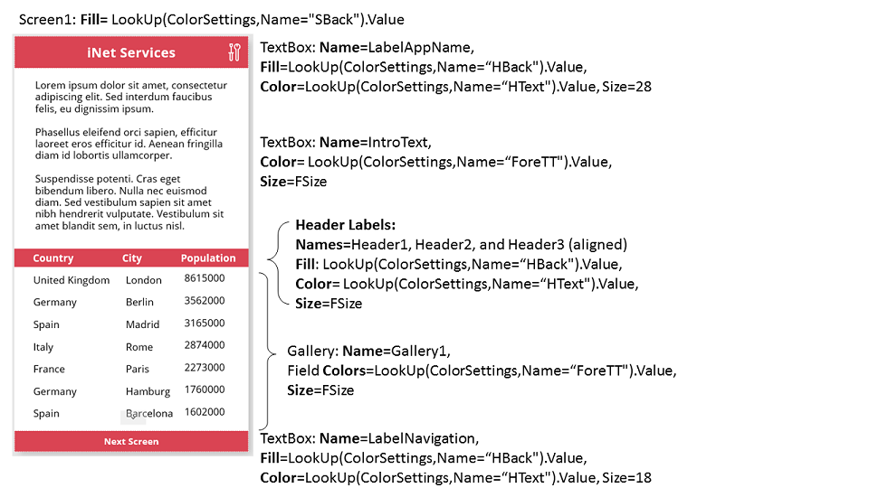
I built a single page app as shown in the image below (feel free to modify this design, but I suggest you keep the control names).

3. The Configuration Icons
I added the “Tools” icon from our PowerApp Icons (so that the user could use it to open the menu of choices). I also created a few icons to represent the different palettes (If you don’t want to design your own phone icons, then mine are in the PowerPoint file as well.) Note: The version on my original twitter feed is using little color palette squares…but what you use as icons is entirely up to your imagination!
After embedding the phone icons as media in my app (Content Tab>Media>Browse), I added 3 image controls to display the phone images. Finally, I sized them small and aligned them side-by-side, and set the following formulas:
|
|
Image: FileNameofIcon1
OnSelect: |
|
|
Image: FileNameofIcon2
OnSelect: |
|
|
Image: FileNameofIcon3
OnSelect: |
|
Slider1 control |
OnChange Property: |
|
Tools Icon |
OnSelect Property: |
4. Setting Up the Menu
After configuring each OnSelect property as shown above, I then added a slider control for text sizing (Slider1) beneath them, and grouped everything so I could display them all with 1 tap on the Tools Icon in the header.
The OnVisible property of the new Group of controls is set to: Conf=true This is so that they would only show up if the value of my variable Conf is equal to true. (Notice the OnSelect formula for the “Tools” icon in the table above.)

I have uploaded my PowerApp file to my OneDrive so you can download it from here, and learn from it. Feel free to use it for your work too! ?
This was surprisingly easy! Isn’t PowerApps the best thing since baked Cinnamon Rolls!? Please let me know if you expand upon this idea for your own PowerApps in the comment area below.
Happy PowerApping,
Audrie
Twitter @ArtsyPowerApper


