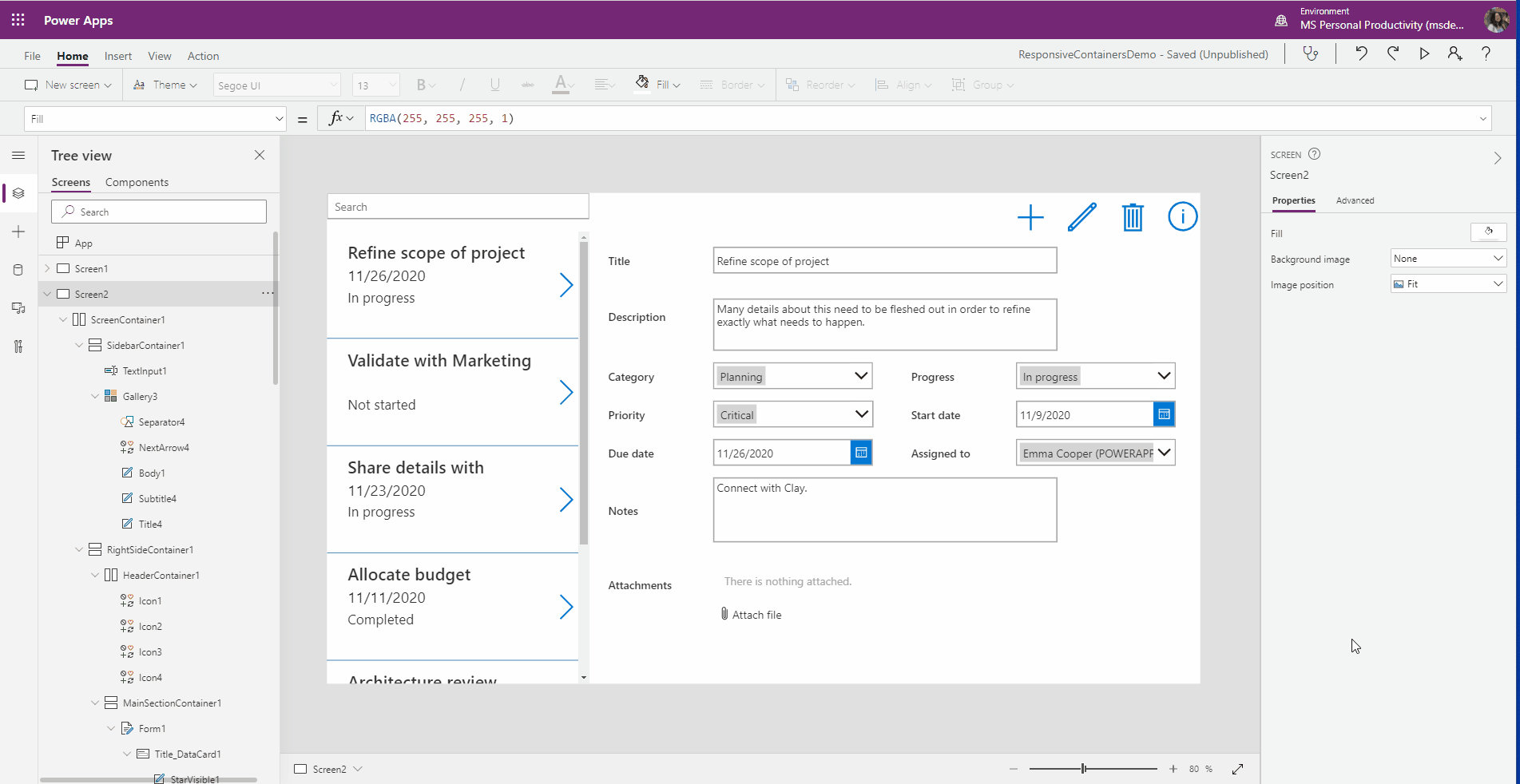
We are excited to announce the preview of the horizontal container and vertical container layout controls that help automatically reflow and resize controls within them to enable easy, no expression responsive layouts in canvas apps. These are available in mainline and Teams authoring experiences.
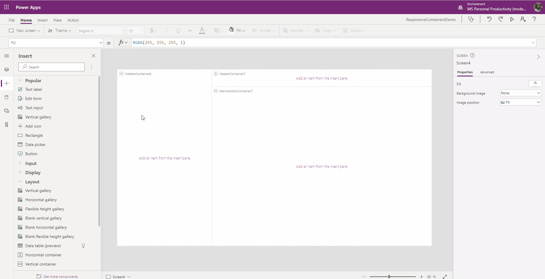
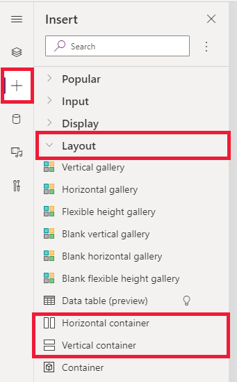
Get started with these controls by navigating to “Insert” on the sidebar, under the Layout category to insert these controls into the canvas. The container control with manual positioning is also in Preview. To enable your app behavior to be responsive, navigate File > Settings > Screen size and orientation, and turn off the Scale to fit setting. Previous responsive expressions will continue to play a complimentary role in the building of responsive apps. For more details, refer to our documentation on responsive apps.
We have also introduced three new screen templates prebuilt with these responsive containers, including a Header, footer, main content layout, split screen, and sidebar layouts.

Additionally, a new capability of the authoring preview now lets you use “Window size” to resize your app before publishing to view resize behavior.
As always, we are eager for feedback and will be listening via our community forum. Wishing you fun building with these new capabilities!
Emma Cooper
Twitter: @PowerEmmz