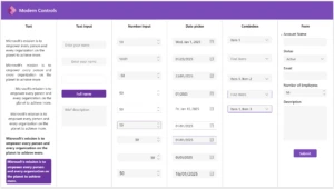
Themes update adds new Office themes and contrast compliant colors
There are 8 new Office themes which make embedded apps inside of SharePoint feel like they belong. The existing PowerApps standard themes have been given a more modern and fresh feel through updating them with contrast compliant colors. Part of an app’s identity is its theme- not only the colors that are chosen, but also where they are applied. Each design language is slightly different. By introducing new and updated themes, we can give the users of our applications a better experience.
New Office themes
The new Office themes have a different look and feel than the PowerApps standard themes. They apply color more minimally, and use the Segoe UI font. They allow a more natural feeling when embedding apps inside of SharePoint. There are 8 new Office options based on the out of the box SharePoint List themes: Blue, Orange, Red, Purple, Green, Gray, Dark Yellow and Dark Blue.
Using one of these Office themes for SharePoint web parts and SharePoint customized forms is a great way to ensure cohesive design. In the images below – there is a good example of a comparison between embedding with the Standard theme in SharePoint and embedding with an Office theme in SharePoint. Note the slight color differences and application of color, especially in the dropdowns.
Updates to PowerApps standard themes
Our PowerApps standard themes have also had a few changes. Some colors and sizes were adjusted in order to create a better feel, and to make them more accessible. In applications color contrast is about providing as much contrast as you can between different contents like text, and the backgrounds. This doesn’t mean limiting your color palette, but rather thinking about how clearly legible your app is for anyone with color blindness and low vision impairments. A contrast ratio of 3:1 is the minimum standard for text and vision. For those with visual impairments however, the contrast ratio standard is 4.5:1, which these themes aid you in achieving in your apps.
A few key differences form the older PowerApps themes is on the dark background themes where the text inputs and dropdowns have a darker color to them. This increases the contrast and makes the theme look more professional and modern.
Theming and branding is an important part of a company’s identity and an app’s identity. This is an area in which the PowerApps team will invest in, and continue to listen to feedback. If you have suggested improvements and features, please add them to PowerApps Ideas or vote for existing ideas.


