The Personal Touch : Personalization in Microsoft Dynamics NAV “6.0”
One of the most important features (if not the most important) of Dynamics NAV ‘6.0’ is the innovative RoleTailored user experience (UX). As the name indicates, the aim of this is to make the content and layout of the screens fit the needs of the various roles of an organization, so there is one UI for the Order Processor, one for the Bookkeeper, one for the Warehouse Worker etc.
But hey, you might think, if I’m an NAV user, how would anyone know exactly which information or tasks I want or need to be available on the various screens I’m using? The answer to that is obviously not, only the user knows exactly what he or she really needs. This is why we made end user personalization a priority when we planned NAV ‘6.0’. The idea is that both when the system originally is implemented the various Roles and pages of ‘6.0’ will be customized to fit the needs of the customer – you could say that it is RoleTailored for the organization. But when each individual user begins using the system they will have their own preferences as to what is displayed and how it is displayed. And for each page in the system, each user can make their own changes and theses changes are being kept in the database so they will travel with the user from PC to PC.
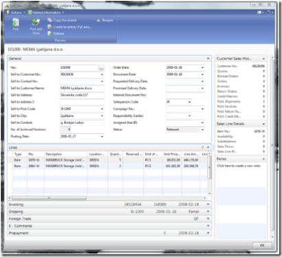
So what can the user change? Well let’s take the Sales Order page as an example:
(click image to see larger size)
Action Pane
The blue area on the top it what we call the ActionPane and the purpose of this is to give 1-click access to actions or other menu items that are relevant and frequently used while editing or viewing the Sales Order. The user can add or remove actions from a list of relevant actions and can furthermore change the size of the icons to make the most frequently used more accessible. In case the user for some reason doesn’t want the ActionPane visible it can also be removed from the page.
FastTabs
If we move down we come to the FastTabs, and as you can see we have made some significant changes to the layout. By the new design we have made it possible to have more than one tab visible at the same time but we have also made it possible to have selected fields visible even if a FastTab is collapsed.
The personalization of the FastTabs is very rich. The user can decide which FastTabs to have visible, which fields are visible both when it is expanded and when it is collapsed, and as a supplement additional fields can be added that only are visible if the user expands the FastTab.
On the Lines you can obviously choose columns and their order, but we have also added a little nifty feature so you can freeze selected columns to the left which is really helpful when scrolling. (and in case you were wondering, YES it will be possible to have more than one line in the header by the time we release J)
FactBoxes
Moving to the right we have the area with the FactBoxes that display information that is related to the content that has focus on the page, but also allows you to drill down to the details of that related information. So you could have a FactBox with additional information for the item with focus on the Lines and from there drill down to investigate substitution items etc.
Here the user can chose which FactBoxes are visible and for each FactBox which fields are shown. Also here the FactBoxes can be removed completely in case the user should want this.
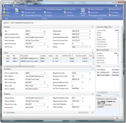
Following personalization the Sales Order page could look like this:
(click image to see larger size)
Very different content but clearly still the Sales Order page, but now with the “Personal Touch”.
With this rich personalization functionality we believe that we will enable not only a RoleTailoring of the NAV UI but actually a “UserTailoring”, that truly will allow each individual user to create the work environment and become more productive and effective than with a more traditional UI.


