


Today, the Microsoft Garage launches a new data visualization tool for PC and Surface Hub. Charts 3D, a Microsoft Garage project, leverages the Universal Windows Platform to empower storytellers to better visualize and explain complex graphs and charts. Presenters can illustrate their key point with a more immersive, interactive 3D object.
The Gap Between Data Crunching and Data Storytelling
We’ve all experienced this problem before: you peer down a long conference table, squinting to read a detailed PowerPoint, while simultaneously trying to follow along with the accompanying narration. A chart bursting with labels, colors, and data, but before you can grasp the insight(s), the presenter flips to the next slide. Whether designed to convey information via a one-way announcement or a two-way conversation, complex data requires robust storytelling, and how you illustrate the data can make all the difference. The team behind our newest Garage project observed that a new approach and toolset could help.
Charts 3D was conceived and created by a small group of innovators in Hyderabad, India the Microsoft India Development Center (IDC), one of Microsoft’s Global Development Centers. In Global Development Centers around the world, Microsoft hosts clusters of teams, just like the one behind this project, who dust off old problems, approaching them with fresh solutions from new frontiers of technology.
Inspired by mixed reality, this team was fascinated by data storytelling, or rather the lack thereof. As they researched the experiences of data scientists, information workers analyzing data, and their respective audiences, they noticed one pain point was experienced across many parties in the data visualization continuum. “Excel and PowerPoint have lots of amazing features that help you build rich and beautiful charts. However, we kept hearing feedback that when data gets really complex, users often struggle to decide which chart will be best to visualize the data and land the insight,” shares Alok Agrawal, Program Manager for Charts 3D. “People would identify these great insights but then find it difficult to show them to others in a presentation.”

The team set out to build a tool that could help bridge the gap between data crunching and data storytelling. They started by building a prototype that could help with one acute scenario: visualizing multi-axis data.
Zoom, Rotate, and Pan Graphs to Tell the Story
Microsoft Office users that want to layer two datasets on top of each other in Excel or PowerPoint can create either a two-dimensional graph with two “Y” axes illustrating different data sets or a three-dimensional, static chart. With some quick design or animation work, the semi-experienced storyteller can leverage these visualizations to show the interplay between the two datasets—and the resulting insights.
Charts 3D makes this even easier; any user who is somewhat familiar with Power BI can drop in two sets of data, and the tool will generate a three-dimmensional, interactive graph or chart. Not only does this alleviate some effort on behalf of the chart creator, but more importantly, the resulting 3D object makes sharing the key insight more straightforward. Specifically, when reviewing the data in a presentation setting, the presenter can illustrate the data from one side, the other, above—any angle that will best illustrate the crucial takeaway.
In addition to equipping presenters to better tell data stories, the interactive 3D object provides a more natural way to find insights altogether. Through Charts 3D, users can zoom, rotate, or pan different graphs and charts using mouse or touch to quickly find the most interesting aspect of their results. To see the full set of features and try out Charts 3D, check out the project description in the Garage Workbench.
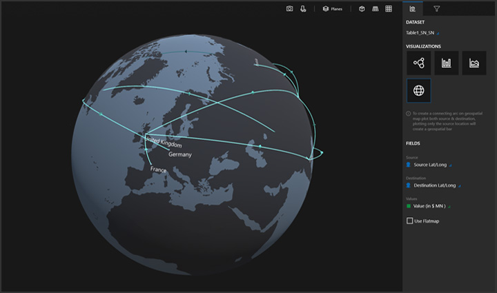
“This is only beginning,” adds Alok excitedly. “Our team was originally inspired to improve data storytelling through mixed reality. We are so curious to see if this first step excites users. From here, we could enhance the original prototype in a variety of directions.” Today, the experience is built with Unity and designed for data visualizers on PC. In the future, the team is excited to explore how they can leverage mixed reality to reinvigorate storytelling for different device types. Similarly, they’ve created a starter set of charts and graphs—users can create scatter plots, line graphs, bar graphs, and geospatial maps for location-based data—but, will look to feedback to determine demand for additional graph and chart types. The unique and rich geospatial map option was designed and built by interns at IDC. Finally, the first version of Charts 3D is largely a standalone experience. The team is listening to the community to explore interest in integration with other Microsoft Office products such as Excel and PowerPoint.
Try Charts 3D
Charts 3D, a Microsoft Garage project, is available for Windows on PC and Surface Hub at the Microsoft Store. Try it out for free.


