
Overview of Search in SharePoint 2013
Quick introduction:
My name is Gerhard Schobbe, I’m the Group Program Manager for the team in the SharePoint organization that’s focused on search scenarios for Information Workers in the Enterprise.
Goals for Release
Let me first talk about the goals for this release.
As for any release, there are several areas we were aiming to make progress in. Three were at the top of the list for the Office 2013 release:
- Move to a single enterprise search platform
- Deliver a truly visible step forward for end users interacting with the search system
- Establish this platform as a more general information access layer for applications, including other parts of SharePoint and, of course, third-party development
I’ll drill down into each one of those and use some examples to highlight the progress we made. This overview post will then be followed by a series of much more detailed tours behind the scenes of the various subsystems, coming over the next weeks and months.
Single Search Platform
First, let’s take a look at the goal to get to a single enterprise search platform. With the acquisition of FAST in mid-2008 and the subsequent release of Office 2010, the Microsoft SharePoint 2010 product line-up includes a two-tiered search offering where the tiers are based on different technology stacks: SharePoint 2010 includes an enterprise search system based on a codebase developed in Redmond and the higher tier includes FAST Search Server 2010, a system developed based on the FAST technology stack in the wake of the acquisition.
However, it was also clear that a system that could combine the best of both implementations would offer a better enterprise search product all around while simplifying choices for our customers, creating a win-win. Even better, the process of re-thinking the overall architecture also offered the opportunity to integrate several of the modern components that FAST had been working on that had not seen broad release yet, including updated content and query processing frameworks.
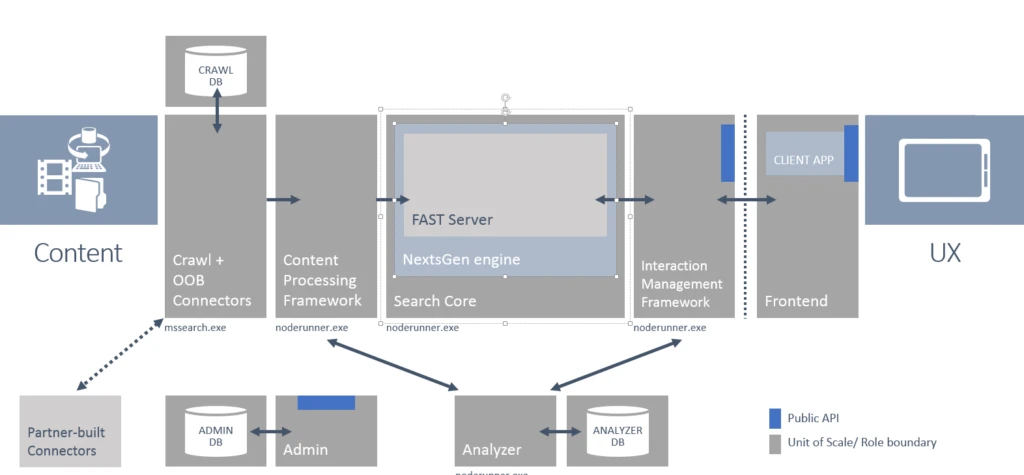
The result of this plan, after several years of engineering work, is a system that combines the crawler and connector framework familiar from SharePoint Search with the next-generation content processing and query processing frameworks from FAST, all working in conjunction with a search core based on FAST Search.
The default user experiences for end users and IT administrators are again hosted in SharePoint—where the end-user experience has been completely re-worked from a server-based rendering approach in 2010 to an asynchronous client-side approach (more on that later).
Additionally, we were able to integrate a new analysis engine that serves as the runtime for a variety of jobs including ranking algorithms and recommendations.
It’s worth mentioning that a lot of work has been done to make the search platform cloud-hosted—it will be powering the O365 service as the latest version is coming online.
The following figure shows a graphical summary.
Create a breakthrough user experience
That brings us to the second investment area, delivering breakthrough improvements for all end users. Traditionally, a user would enter a set of search terms on a search center homepage that would be treated as keywords, and the results were a single ranked list of links with three-line summaries and a little metadata. Let me describe how we moved to the next level in each case.
Search Center homepage is the main entry point:
In this release, every search box in every teamsite offers full access to enterprise-wide search, people search, and other specialized search experiences in addition to the traditional scoped site search. Users can access the desired scope from the drop-down list inside the search box.
This puts the power of enterprise-level search experiences at the fingertips of any user working in a team site or one of the various hubs around SharePoint.
Every term is a keyword:
A close analysis of several customer query logs that we obtained permissions for showed clearly that many user queries are a mix of keywords and command words, where the latter might indicate the type of result the user is looking for. Another large class of queries were navigational queries in the sense that the expected result was a location, be it a team site, some other website, a document library, or even a particular document the user has already used a few times.
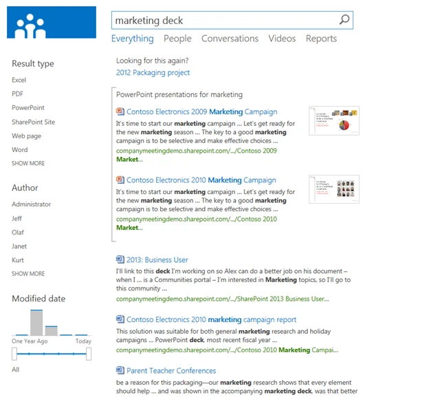
To expand on the concept of command words, let’s look at the example “marketing deck”. The user is clearly (to human eyes) looking for a presentation about marketing—but none of the presentations will contain the word “deck”—that’s just the common lingo. It makes much more sense to classify the terms in the query into actual keywords (“marketing” in this case) and command words that need to be transformed into other constraints on the query, in this case a type constraint that limits the result type to all file types defined as presentations. The same idea applies, for example, to hints that the user is looking for a site or specifically looking for documents that are not webpages. This thought process led to the introduction of Query Rules, a generalized, extensible system for query analysis that maps the terms of a query into keywords and enables the transformation of the command words into property queries. Query Rules also have more advanced capabilities including leveraging user behavior to create result blocks. Additional blog posts will go much deeper into all the things that can be accomplished using Query Rules.
Single ranked list of results:
Query Rules allow for several interpretations of the same query. Maybe one interpretation focuses on a type restriction like in the example above, resulting in a set of documents. Another rule could trigger on “Marketing” being a well defined discipline from a dictionary of job categories at a company like Microsoft and so bring back a set of results specifically scoped to the corporate HR repository containing carefully moderated content for each discipline. And, it probably also makes sense to assume that both of those interpretations could be wrong and that the traditional keyword query against the index had the best chance to dig up the right results that the user was looking for. Recombining the three sets of results into a single page led to the concept of result blocks. These augment the single ranked list of individual results with a ranked set of blocks that are inserted at various locations, each block containing individually ranked results.
Again, this whole area requires a much more detailed explanation to show the power of the underlying concepts.
The following screenshot shows an example—the results page for the query “marketing deck” shows a block with the “decks” (the presentations) that match the query “marketing”, followed by the regular results for the full query.
Links with three-line summaries:
It was clear that the attempts to cram even more information into the same amount of pixel space available on screen wasn’t going to achieve true improvements in terms of a user’s ability to inspect the results quickly to find the best one. The solution became a hover panel that could be made much larger to show visual previews of sites, documents, and conversations. It also gave us room to expand from an experience designed implicitly as a one-way street into reading a document or webpage into an extensible set of actions that users could perform right on the search result. For example, following a document, jumping right into Edit mode, or sharing or opening the library the document is stored in to see what other content is available—and those are just the default actions.
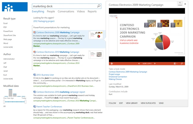
Last but not least, rather than betting only on textual summaries, we enabled the extraction of the semantic sections for several document types, which are shown as powerful “deep links” inside the hover panel. Because it is likely that the slide titles in a PowerPoint presentation were carefully designed by the presenter to summarize the content of each slide, even if the filename is not particularly descriptive.
We now extract and show the slide titles responding to the keywords, allowing a user to zoom from a query over 100 million items in the index down to a single slide with a relevant title—and then open the presentation exactly at that slide with a single click. This feature is also available for Word documents and Excel documents (focused on graphs and named tables) in addition to SharePoint sites (top subsites and document libraries).
The UI framework that supports all these new features has also been re-designed. It is based on a set of nested layout templates that are defined in JavaScript and HTML for much easier extensibility. Every result type has a template to control the layout in the results list and a hover panel template. Block layouts are controlled by a separate template and then the layout of all results is defined by a group template—all of which can be adapted to the desired presentation layout. One example is that the Video search that is included by default uses a grid layout with customized result layouts to present the video results. Quite a different look, achieved by merely changing a template with no code changes to the base results webpart required.
Together, these improvements create a powerful and highly responsive user experience that is accessible from anywhere in SharePoint, that understands the user query much better, and that delivers highly visual results with direct access to the most granular information inside of sites and documents, and then enables users to act on the results without having to leave the results page.
The following image shows an example of what that experience looks like for a PowerPoint presentation: links to the relevant slide titles inside the file, a visual preview that allows the user to page through the deck interactively and a set of action links along the bottom of the panel.
Search as an information access platform
The third goal was to establish the search platform as a more generalized information access platform.
A properly configured enterprise search index constitutes an amazing collection of information available in an enterprise—it crosses the information silos of different document management systems and also normalizes the metadata schema across these systems.
Exposing all this information as an interactive, keyword-driven user experience is nice, but why stop there? There are many information experiences that would benefit from pulling together a user-centric view that disregards the boundaries of the underlying silos and takes advantage of content keyword-based matching and ranking to show the most appropriate items first.
To show what this means, I want to highlight some of the examples that are included by default in SharePoint 2013:
- In MySites, users can access a list of all SharePoint tasks assigned to them, regardless of which sites the assignments are stored in.
- Every document library now has a search box at the top that enables users to search across metadata and the full text of its documents, and the result list is presented as a standard SharePoint view rather than as a results page.
- Clicking on a hash tag in a post or discussion shows a list of all conversations about that topic enterprise-wide.
There are many more exciting new features available in this release, like a new way to define types based on rules (for example, a contract should be different than the generic file type “Word”), better out-of-box relevance that is tunable in the UI and via XRANK, eDiscovery that spans SharePoint and Exchange, continuous crawl that keeps content even more fresh, facilities to combine results from O365 tenancies with on-premises results in ‘hybrid’ configurations, and the system now offers CSOM and RESTful APIs and much, much more.
We hope you like it—sign up for the O365 Preview environment online, or download the bits here and install it on a local machine.
Let us know what you think!