
Practitioners increasingly use visualizations “in the wild” to tell compelling stories supported by data, and continually develop novel techniques that help integrate data visualization into narrative stories. The visualization research community has recently begun to pay more attention to the need and use of visualization as a storytelling medium to tell engaging visual data-driven stories. In addition to understanding the data story creation process and the techniques used in successful data stories, we explore ways to enable people to easily create data-driven stories.
Role and Interplay of Narrations and Animations in Data Videos

In this work, we study how data videos use narrations and animations to convey information effectively. We conduct a qualitative analysis on 426 clips with visualizations extracted from 60 data videos collected from a variety of media outlets, covering a diverse array of topics. We manually label 816 sentences with 1226 semantic labels and record the composition of 2553 animations through an open coding process. We also analyze how narrations and animations coordinate with each other by assigning links between semantic labels and animations. With 937 (76.4%) semantic labels and 2503 (98.0%) animations linked, we identify four types of narration-animation relationships in the collected clips. Drawing from the findings, we discuss study implications and future research opportunities of data videos.
CAST (opens in new tab)
 CAST is an authoring tool that enables the interactive creation of chart animations. It introduces the visual specification of chart animations consisting of keyframes that can be played sequentially or simultaneously, and animation parameters (e.g., duration, delay). Building on Canis, a declarative chart animation grammar that leverages data-enriched SVG charts, CAST supports auto-completion for constructing both keyframes and keyframe sequences. It also enables users to refine the animation specification (e.g., aligning keyframes across tracks to play them together, adjusting delay) with direct manipulation and other parameters for animation effects (e.g., animation type, easing function) using a control panel.
Data Visceralization
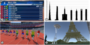 A fundamental part of data visualization is transforming data to map abstract information onto visual attributes. While this abstraction is a powerful basis for data visualization, the connection between the representation and the original underlying data (i.e., what the quantities and measurements actually correspond with in reality) can be lost. On the other hand, virtual reality (VR) is being increasingly used to represent real and abstract models as natural experiences to users. In this work, we explore the potential of using VR to help restore the basic understanding of units and measures that are often abstracted away in data visualization in an approach we call data visceralization. By building VR prototypes as design probes, we identify key themes and factors for data visceralization. We do this first through a critical reflection by the authors, then by involving external participants. We find that data visceralization is an engaging way of understanding the qualitative aspects of physical measures and their real-life form, which complements analytical and quantitative understanding commonly gained from data visualization. However, data visceralization is most effective when there is a one-to-one mapping between data and representation, with transformations such as scaling affecting this understanding.
Canis (opens in new tab)

Canis is a high-level domain-specific language that enables declarative specifications of data-driven chart animations. By leveraging data-enriched SVG charts, its grammar of animations can be applied to the charts created by existing chart construction tools. With Canis, designers can select marks from the charts, partition the selected marks into mark units based on data attributes, and apply animation effects to the mark units, with the control of when the effects start. The Canis compiler automatically synthesizes the Lottie animation JSON files, which can be rendered natively across multiple platforms.
Critical Reflections on Visualization Authoring Systems
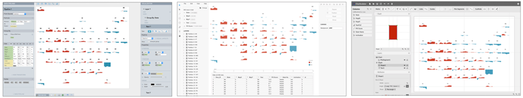
An emerging generation of visualization authoring systems support expressive information visualization without textual programming. As they vary in their visualization models, system architectures, and user interfaces, it is challenging to directly compare these systems using traditional evaluative methods. Recognizing the value of contextualizing our decisions in the broader design space, we present critical reflections on three systems we developed—Lyra, Data Illustrator, and Charticulator. This paper surfaces knowledge that would have been daunting within the constituent papers of these three systems. We compare and contrast their (previously unmentioned) limitations and trade-offs between expressivity and learnability. We also reflect on common assumptions that we made during the development of our systems, thereby informing future research directions in visualization authoring systems.
ShapeWordle (opens in new tab)
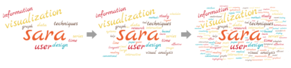
 ShapeWordle is a new technique to enable the creation of shape-bounded Wordles, in which we fit words to form a given shape. To guide word placement within a shape, we extend the traditional Archimedean spirals to be shape-aware by formulating the spirals in a differential form using the distance field of the shape. To handle non-convex shapes, we introduce a multi-centric Wordle layout method that segments the shape into parts for our shape-aware spirals to adaptively fill the space and generate word placements. In addition, we offer a set of editing interactions to facilitate the creation of semantically-meaningful Wordles.
DataToon

Comics are an entertaining and familiar medium for presenting compelling stories about data. However, existing visualization authoring tools do not leverage this expressive medium. In this paper, we seek to incorporate elements of comics into the construction of data-driven stories about dynamic networks. We contribute DataToon, a flexible data comic storyboarding tool that blends analysis and presentation with pen and touch interactions. A storyteller can use DataToon rapidly generate visualization panels, annotate them, and position them within a canvas to produce a visually compelling narrative. In a user study, participants quickly learned to use DataToon for producing data comics.
Reflecting on the Evaluation of Visualization Authoring Systems

In this paper, we discuss the challenges one faces when evaluating authoring systems developed to help people design visualization for communication purposes. We reflect on our own experiences in evaluating the visualization authoring systems that we have developed as well as the evaluation methods used in other recent projects. We also examine alternative approaches for evaluating visualization authoring systems that we believe to be more appropriate than traditional comparative studies. We hope that our discussion is informative, not only for researchers who intend to develop novel visualization authoring systems, but also for reviewers assigned to evaluate the research contributions of these systems. Our discussion concludes with opportunities for facilitating the evaluation and adoption of deployed visualization authoring systems.
Charticulator (opens in new tab)
 The ability to create a highly customized visual representation of data, one tailored to the specificities of the insights to be conveyed, increases the likelihood that these insights will be noticed, understood, and remembered by its audience. This expressiveness also gives the author of this visual representation a competitive advantage in a landscape awash in conventional charts and graphs. Charticulator is an interactive authoring tool that enables the creation of bespoke and reusable chart layouts. Charticulator is our response to most existing chart construction interfaces that require authors to choose from predefined chart layouts, thereby precluding the construction of novel charts. In contrast, Charticulator transforms a chart specification into mathematical layout constraints and automatically computes a set of layout attributes using a constraint-solving algorithm to realize the chart. It allows for the articulation of novel layouts with expressive glyphs and links between these glyphs, without requiring any coding or knowledge of constraint satisfaction. Furthermore, thanks to the constraint-based layout approach, Charticulator can export chart designs into reusable templates that can be imported into other visualization tools.
Data Videos Evaluation

Pictographic representations and animation techniques are commonly incorporated into narrative visualizations such as data videos. General belief is that these techniques may enhance the viewer experience, thus appealing to a broad audience and enticing the viewer to consume the entire video. However, no study has formally assessed the effect of these techniques on data insight communication and viewer engagement. In this paper, we first propose a scale-based questionnaire covering five factors of viewer engagement we identified from multiple application domains such as game design and marketing. We then validate this questionnaire through a crowdsourcing study on Amazon’s Mechanical Turk to assess the effect of animation and pictographs in data videos. Our results reveal that each technique has an effect on viewer engagement, impacting different factors. In addition, insights from these studies lead to design considerations for authoring engaging data videos.
DataInk (opens in new tab)

Creating whimsical, personal data visualizations remains a challenge due to a lack of tools that enable for creative visual expression while providing support to bind graphical content to data. Many data analysis and visualization creation tools target the quick generation of visual representations, but lack the functionality necessary for graphics design. Toolkits and charting libraries offer more expressive power, but require expert programming skills to achieve custom designs. In contrast, sketching affords fluid experimentation with visual shapes and layouts in a freeform manner, but requires one to manually draw every single data point. We aim to bridge the gap between these extremes. We propose DataInk, a system supports the creation of expressive data visualizations with rigorous direct manipulation via direct pen and touch input. Leveraging our commonly held skills, coupled with a novel graphical user interface, DataInk enables direct, fluid, and flexible authoring of creative data visualizations.
Visual Narrative Flow (opens in new tab)

Many factors can shape the flow of visual data-driven stories, and thereby the way readers experience those stories. Through the analysis of 80 existing stories found on popular websites, we systematically investigate and identify seven characteristics of these stories, which we name “flow-factors.” These flow-factors are navigation input, level of control, navigation progress, story layout, role of visualization, story progression, and navigation feedback. We conducted a series of studies, sheding initial light on how different visual narrative flows impact the reading experience. We gathered reactions and preferences of readers for stepper- vs. scroller-driven flows, and explored the effect of the combination of different flow-factors on readers’ engagement.
Timeline Storyteller (opens in new tab)
 Timelines have been used for centuries to visually communicate stories about sequences of events, from historical and biographical data to project plans and medical records. We proposed a design space for expressive storytelling with timelines based on a survey of 263 timelines. In addition, we designed and developed a timeline storytelling tool, called Timeline Storyteller, realizing the expressive potential of the design space.
ChartAccent (opens in new tab)
 Annotation plays an important role in conveying key points in visual data-driven storytelling; it helps presenters explain and emphasize core messages and specific data. However, existing charting software provides limited support for creating annotations. We characterize a design space of chart annotations based on a survey of 106 annotated charts published by six prominent news graphics desks. Using this design space, we designed and developed ChartAccent, a tool that allows people to quickly and easily augment charts via a palette of annotation interactions that generate manual and data-driven annotations.
DataClips (opens in new tab)
 Data videos, or short data-driven motion graphics, are an increasingly popular medium for data-driven storytelling. However, creating data videos is difficult as it involves pulling together a unique combination of skills. We designed and developed DataClips, an authoring tool aimed at lowering the barrier to craft data videos to enable non-experts to assemble data-driven “clips” together to form longer sequences. DataClips provides the library of data clips developed from the analysis of the 70 data videos produced by reputable sources such as The New York Times and The Guardian.
Graph Comics (opens in new tab)
We explored if we can take advantage of the visual expressiveness and familiarity of comics to present and explain temporal changes in networks to an audience. To understand the potential of comics as a storytelling medium, we first created a variety of comics, involving domain experts from public education and neuroscience. Through this 3 month-long design process, we identified eight design factors for creating graph comics and proposed design solutions for each.
Storytelling Techniques
 Storytelling with data is becoming an important component of many fields such as graphic design, the advocacy of causes, and journalism. Authors are enabling new reader experiences, such as linking textual narrative and data visualizations through dynamic queries embedded in the text. Novel means of communicating position and navigating within the narrative also have emerged, such as utilizing scrolling to advance narration and initiate animations. We advance the study of narrative visualization through an analysis of a curated collection of recent data-driven stories shared on the web. Drawing from the results of this analysis, we present a set of techniques being employed in these examples, organized under four high-level categories that help authors tell stories in creative ways.
Storytelling Process
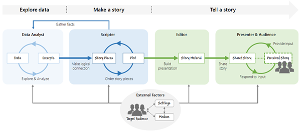 Visualization research on storytelling has mainly centered on how data visualization components contribute to communication. Instead, we argue for expanding our research focus to the whole process of transforming data into visually shared stories, including formative processes such as the crafting of narrative structures. We provide a detailed description of the storytelling process in visualization with regard to activities, artifacts, and roles involved to develop a more encompassing look at the visual storytelling process and to uncover open areas for research.
WordlePlus (opens in new tab)
 We open new possibilities of Wordle, a visualization technique commonly used to summarize texts. WordlePlus is an interactive authoring tool that leverages natural interaction and animation. It supports direct manipulation on words with pen and touch interaction, enabling more flexible wordle creation. WordlePlus introduces new two-word multi-touch manipulation, such as concatenating and grouping two words, and provides pen interaction for adding and deleting a word. In addition, WordlePlus employs animation to amplify the strength of Wordle, allowing people to create more dynamic and engaging wordles.
VisJockey (opens in new tab)

We increasingly encounter an integration of interactive visualizations into data stories in news media, blog posts, etc. However, these stories usually do not provide enough guidance on how to interpret and manipulate the accompanied visualizations. Therefore, readers are often on their own in finding the right state and area of visualization authors intended to show to support their arguments. VisJockey is a technique that enables readers to easily access authors’ intended view through orchestrated visualization. To offload readers’ burden in making connections between the text and the visualization, VisJockey augments the visualization through highlight, annotation, and animation.
SketchStory
 To create a new, more engaging form of storytelling with data, we leverage and extend the narrative storytelling attributes of whiteboard animation with pen and touch interactions. SketchStory is a data-enabled digital whiteboard that facilitates the creation of personalized and expressive data charts quickly and easily. SketchStory recognizes a small set of sketch gestures for chart invocation, and automatically completes charts by synthesizing the visuals from the presenter-provided example icon and binding them to the underlying data. Furthermore, SketchStory allows the presenter to move and size the completed data charts with touch, and filter the underlying data to facilitate interactive exploration.
People
Yun Wang
Senior Researcher
Nathalie Henry Riche
Senior Principal Research Manager