

Over the past 10 months, the Microsoft Academic UX team has been working to improve the Microsoft Academic website (opens in new tab) user experience. During this time, we looked at how we can improve the search experience and also bring new insights to the research topics that users find interesting. One goal is to bring users awareness of quality research in both their domain and other domains that may share common research. The Microsoft Academic Graph that powers our web experience is massive and freely available, and our UX work builds on that Academic Graph to surface both the breadth of knowledge contained, and maximize the data’s value.
This blog is part 1 of a 3-part series where we will introduce the changes that have been made in this iteration of the site and highlight the search experience, and new data insights. In today’s blog, we will cover the changes we made to the interface, highlighting search and “entity” type pages. In the second post, we will cover changes to the personalization features and finally, in the third post of the series, we will talk about analytics.
A new UI
After introducing some analytics to our site at the beginning of last year, we decided it would be a good time to reflect on what we have built so far. We wanted to bring a more inviting look to the site and improve the overall user experience in the process. Our goals were to focus on a UI that would allow us to expand our offerings and also breathe some new life into the data via additional analytic views. In doing that, we also wanted to stay true to our core search user experience while presenting new users with examples of how to better interact with our semantic search model. We started with our home page.
The home page
First and foremost, we still offer rich semantic query interpretation in our core feature: search. The search box on our home page and throughout the site is designed to guide users to the information that they are seeking and to pare down the results quickly.
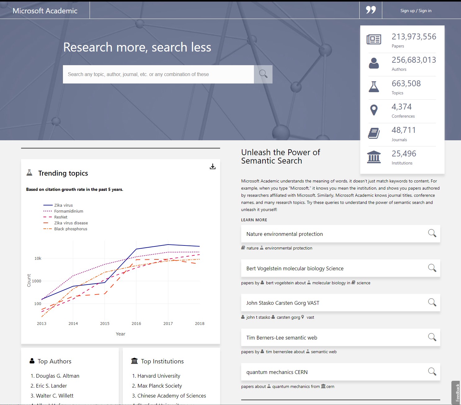
For non-signed in users, we take the opportunity to demonstrate our semantic search language, as well as some analytics that we have gathered about the data in our graph. The query examples encourage users to interact through the query suggestion dropdown, featuring pre-generated semantic queries.
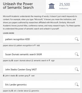
As further explained in the FAQ (opens in new tab), the query suggestion dropdown is designed to show how a query is dynamically interpreted as entered on each keystroke. As a query term can have multiple interpretations, we have designed the dropdown for disambiguating, confirming, and even suggesting query intent. We strongly recommend everyone try a couple of queries to see how this highly interactive experience works for them.
Understanding how to interact with our semantic query engine will help new users refine results and give them exactly what they are looking for. Please note a unique feature: the semantic engine is designed to generate only semantically coherent suggestions in the dropdown, i.e., any of the suggestions will guarantee non-empty semantic search results. If the dropdown list is depleted during the formulation of a query, it is a sign that some query terms or their combinations have led to no semantic search results. Sometimes, this occurs because of typos, but it is also a handy utility to quickly check whether a person has ever co-authored any paper with another, or if an institution has any papers or patents on a particular topic. When the dropdown indicates no semantic interpretation can be found, the query will be processed with a keyword-matching algorithm rather than the default semantic one.

The analytic features and top lists draw attention to another area of our site: analytics. These analytics pages present rankings and trending data for authors, institutions, journals, and conferences, based on the chosen topic. We have also made the data behind the charts downloadable, so that users can examine them further or plot their own data visualizations. We will discuss more about our analytics experiences in future posts.
Search results
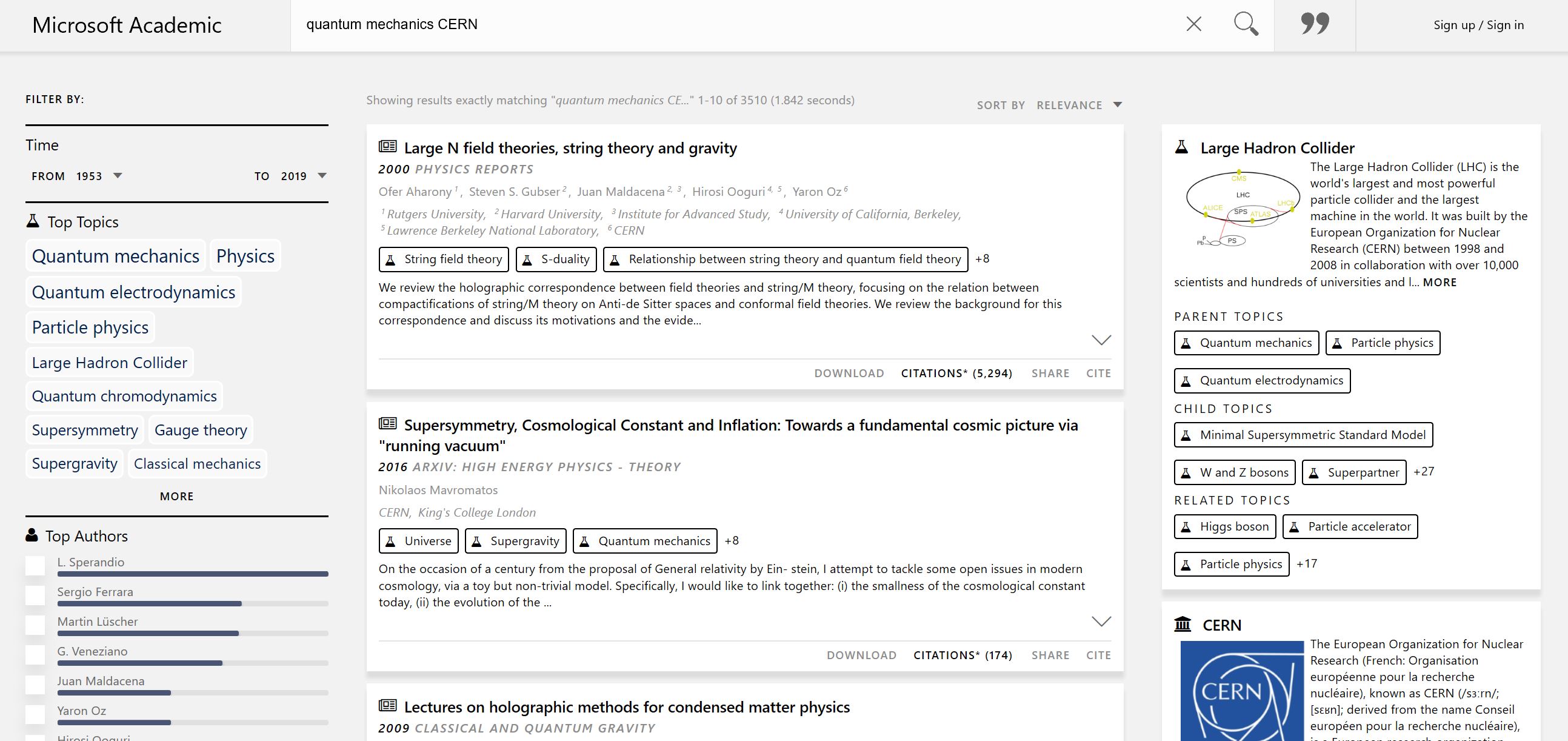
Relevant search results are most important to users. Most of what appears in the search results page is similar to our previous version of the site, with some visual changes. In the center (if viewed via a desktop PC), we present the results from a query. We have expanded the results per page from 8 to 10, and provided some whitespace and visual effects to help process the information in each result. In the filters section, we highlight topics and entities that exist in the result set, ranked by relevance. This was true in our previous version, but we do a better job highlighting that now. Finally, if we have found semantic entities in the query, we present them in cards on the right. We believe this helps the user see how we have interpreted their query and offer additional areas for exploration. These cards are specifically useful when searching for authors with common names.
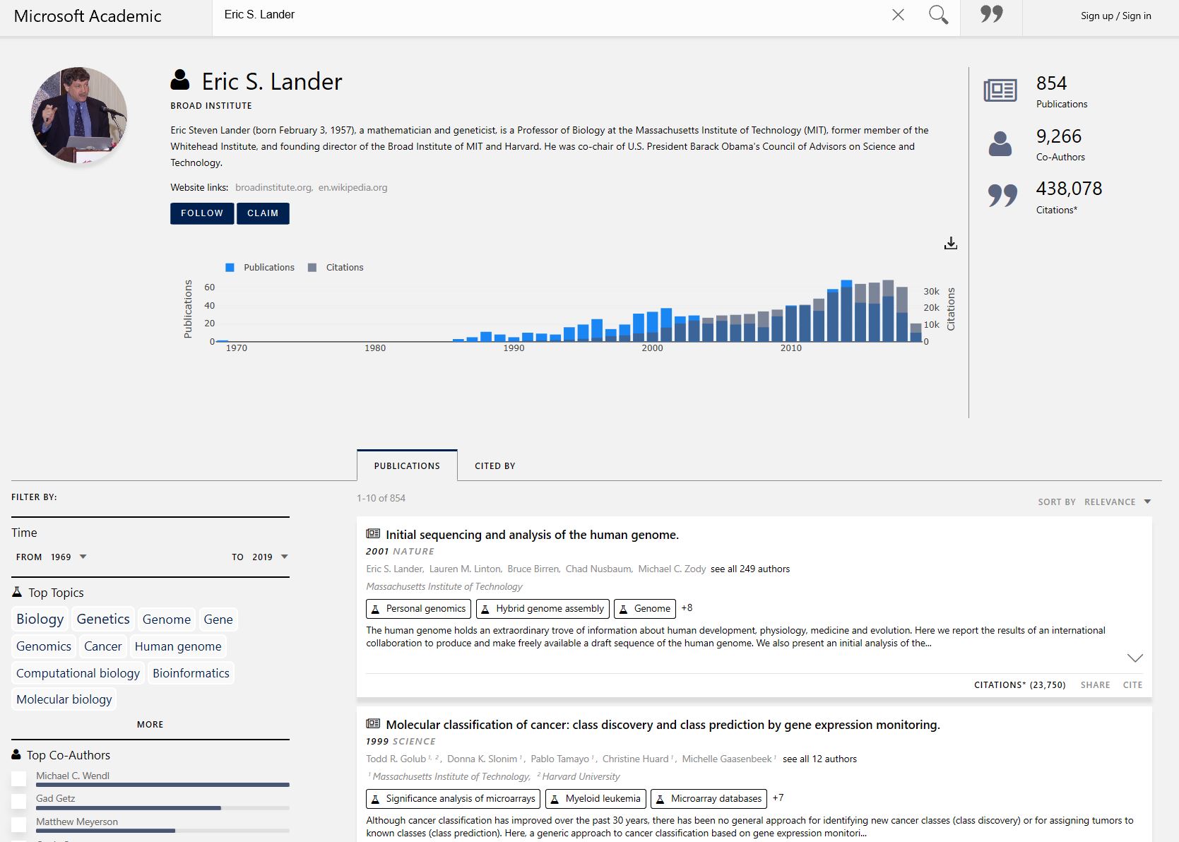
“Entity” detail pages
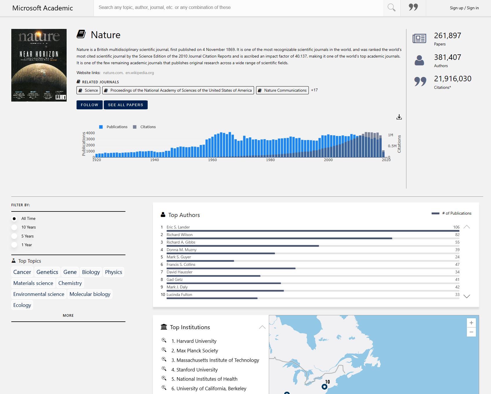
We have rich data about the entities in our graph and are bringing more and more of that to our users, so we focused on this area in this update. Each of the “entities” (paper, author, institution, journal, or conference) in our graph have pages that are tailored specifically to that type of entity. When one views a paper, one sees information specific to the paper, including references, citations, and related papers; all filterable. When viewing an institution, users will see publication data, as well as analytics for top authors, journals, and conferences. Journals give the user publishing data, along with top authors and institutions. Conference pages have links to proceedings and important dates, along with top author and institution analytics. Each of these pages brings more information to the foreground and really shows the power of our graph.
Summary
Our goal is to help users find the research they are looking for and, enrich their search with other relevant areas to explore that might have gone unnoticed. We currently have more than 214,000,000 papers in our graph and will continue to expand. We welcome users to provide us with suggestions, including areas where we can improve, or new desired features, via the feedback tab on our site.