In contrast, the abstract visualization of book texts is not a large or a mature field of study, but there are notable and inspirational examples. The following sections list some of these
Clarence Larkin’s “Dispensational Charts”
 (opens in new tab)Data visualizations fall into two overlapping camps: exploration and communication. Larkin’s 1914-1918 Dispensational Charts (opens in new tab) are about communicating scripture and prophesy from The Bible. They diagram the structure of each topic (e.g. “The Heavens” or “The Second Coming”) and use flow, representational images, and references back to Bible passages to illuminate each topic.
Text Arc
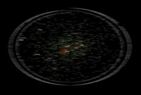
 (opens in new tab)The seminal work of abstract exploratory visualization of book texts is Brad Paley’s “Text Arc (opens in new tab)“. TextArc is a screen based application Paley designed and implemented that takes a text and displays it twice. Firstly, line by line in tiny font around the edge of a giant ellipse. And then secondly word-by-word with each word anchored by invisible springs to the sentences in which it occurs. Common words are removed (so called ‘stop words (opens in new tab)‘) and the remaining words are rendered so that more common words use a larger font and are drawn on top of any less common words sharing the same screen area. Paley’s TextArc can be used to explore any text but he often demonstrates it using Alice in Wonderland and then at the centre, in big letters, is the word Alice as that occurs throughout the book. TextArc has many other features, including an elegant dynamic path sweeping through the work as the text is read through.
Text Arc was conceived as a tool to help academics and other readers analyse texts. Another outlet proved to be selling high quality printouts as a beautiful memento of one’s favourite texts. The application of book visualization to academic literary studies has been continued in work like Plaisant et al’s “Exploring Erotics in Emily Dickinson’s Correspondence (opens in new tab)“.
Partly because of the widespread availability of electronic versions of the text, partly because of its cultural significance, and partly because of the huge numbers of people who care about it The Bible has proved an intriguing source of visualizations.
Anh Dang’s “Gospel Spectrum”
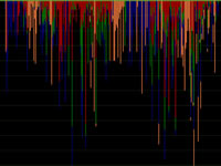
 (opens in new tab)While on NYU’s Interactive Telecommunications Programme (opens in new tab)Anh Dang built “Gospel Spectrum (opens in new tab)“, an interactive visualization exploring the gospel accounts of Christ’s life. Each episode in Christ’s life is represented as a coloured bar with the colours representing the different gospels and their length representing the number of verses spent on that episode. The resulting visualization allows one to see how Christ’s life unfolds through the gospels: which gospels concentrate on which parts of his life, and when the gospels come together to record an episode.
Linda Becker’s “In Translation”
 (opens in new tab)Started at Central Saint Martin’s School of Art (opens in new tab), Becker’s “In Translation (opens in new tab)” shows visually the structural similarities and differences between different language translations of the Tower of Babel story, for example showing the position allocated to each letter-combination. “In Translation” both enforces the message of The Tower of Babel Story by highlighting the differences between human languages, but also cuts across it by showing structural similarities.
Chris Harrison’s “Bible Visualizations”
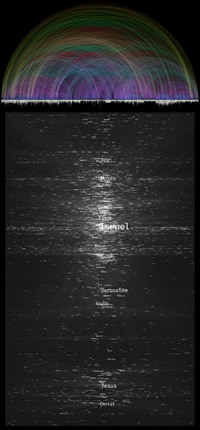
 (opens in new tab)Chris Harrison’s visualizations of The Bible (opens in new tab)follow two paths. Firstly Harrison took a set of textual cross references found in The Bible compiled by Lutheran Pastor Christoph Romhild and displayed the links visually, resulting in a beautiful picture that gives detail about which chapters contain most cross references that also impresses the viewer with the sheer number of cross references. The second set looks at proper nouns through The Bible and overlays them as a tag cloud. But rather than abstracting the positions of the nouns from their occurrence in the text they are placed at their ‘centre of mass’.
Steinweber and Koller’s “Similar Diversity”
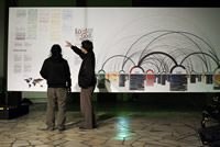
 (opens in new tab)The last Bible visualization we’ll touch on is Steinweber and Koller’s “Similar Diversity (opens in new tab)“. Like Harrison’s work Steinweber and Koller use arc-diagrams (opens in new tab)and other visual features, but rather than using them to explore the structure within The Bible Similar Diversity shows the similarities and differences between holy books of different religions.
Before moving on to describe our own visual explorations of the text of Pullman’s His Dark Materials trilogy there are four other interesting book visualization projects that are worth drawing attention to because of other potential features they make use of.
Ebany Spencer’s “Romancing Dimensions”
 (opens in new tab)In her CSM MACD project “Romancing Dimensions (opens in new tab)” Ebany Spencer attempts to use purely visual notations systems to retell Edwin Abbott Abbott’s “Flatlands” story. Though entirely paper based Spencer’s work uses three dimensions by using paper cut-outs to move some of her time-line representations of the work out from the background plane.
Tim Walter’s “textour”
Tim Walter’s textour (opens in new tab) (in German) has uses time and animation to show the structural elements of the book accruing as data is added or filtered.
Stephanie Posavec’s “Writing Without Words”
 (opens in new tab)Stephanie Posavec’s beautiful visualizations (opens in new tab) of Jack Kerouac’s “On the Road” (and some other contrasting novels) are not the result of a computer analysis of the work but the result of careful, loving, and painstaking analysis by-hand of the text itself. Posavec produces several visualizations, from the spider-like Posavec diagrams which map the sentence lengths authors’ use (a line continues for the length of the first sentence, then turns ninety degrees and continues for the length of the second sentence, etc) through to the elegant ‘literary organism’ flower like structures.
IBM Research’s Visual Communications Lab’s “Many Eyes”
Many Eyes (opens in new tab) is a social visualization site. It is social in many ways: users upload data sets that are immediately shared with all the other Many Eyes members; anyone can use any of the provided visualization tools to visualize the data sets; these visualizations can be shared and discussed on the Many Eyes sites, or embedded into blog posts to foster conversation and analysis beyond the site. Many Eyes was conceived, designed, and built by IBM Research’s Visual Communications Lab (opens in new tab). It was originally thought that most of the datasets and visualizations would be based on numeric data, and so the visualizations were tailored towards quantitative data. In fact the inventors were taken aback by the amount of textual data sets uploaded, including notably The Bible and political speeches, and they have written about the text based visualizations designed and added in response [WV08].
People
Ken Woodberry
Principal Software Engineering Lead, Azure Sphere
