“Wait, what are we looking at here?”
We all know the situation. We’re in a meeting, someone projects a graph, and starts excitedly talking about it. The audience is confused. They can’t see how the graph supports what the person is saying. Even worse, they can’t even figure out what the graph is supposed to be showing. If you were to poll the audience, you’d get as many interpretations as attendees.
Why is this?
The person who made the graph suffers from what behavioral scientists call the curse of knowledge. Because they know the story of how the graph was made, they can’t appreciate how it looks to someone who doesn’t.

What can we do about it?
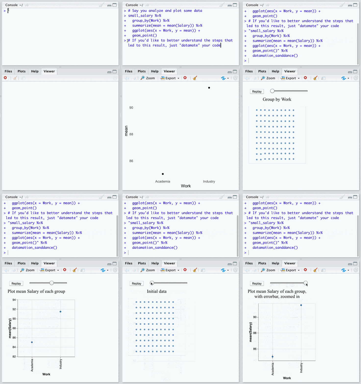
Tell a story of how the graph came to be. Datamations are powerful animations that show the story of how data are sliced, sifted, and transformed on their way to the final visualization. Datamations help readers by showing each step of the process in an easy-to-understand visual format. Our published research shows that Datamations not only help people understand plots and tables, and also that people prefer seeing Datamations more than figures alone. We’re also creating a Datamations library (opens in new tab) to make it easy for analysts who create plots and tables to automatically animate them.
The process is simple: just give our library the code that created a plot or table, and you get back an animation you can show readers that explains that code. Check out the Datamations library and contribute.
