

AI For Good Lab
Harnessing AI to help solve some of the world’s greatest challenges


“Now is the time for urgent action. Those of us that can do more, should do more. But the challenges we face are complex, and no one company, sector, or country can solve them alone.”
-Brad Smith, Vice Chair & President of Microsoft
What if AI could listen to the rainforest or watch over endangered species in real time?
Microsoft CVP and Chief Data Scientist Juan M. Lavista Ferres introduces SPARROW, a solar-powered edge AI device that does just that—analyzing sounds and images on-site and beaming instant insights to conservationists via satellite, transforming how we protect nature’s most fragile ecosystems.
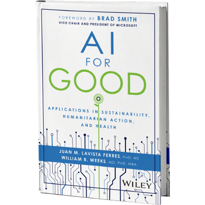
AI for Good: Applications in Sustainability, Humanitarian Action, and Health
In this book by Microsoft’s Chief Data Scientist Juan Lavista Ferres, discover how mission-driven leaders and AI researchers are using technology to transform the world for the better. With foreword from Brad Smith, Vice Chair and President of Microsoft.

Challenges we face

33M people are affected by food insecurity.

70% decline in our planet’s wildlife since 1970

1.3B people or 1 in 6 in the world live with a disability
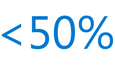
<50% of people globally have access to essential health services.
Stories about our progress

Detecting ghost nets: Oceans’ hidden threat
Ghost nets endanger countless marine species, silently drifting across our oceans. Using AI-driven analysis of high-resolution sonar data, researchers achieve 94% detection accuracy and reduce manual review from hours to minutes, enabling scalable retrieval. This research-led approach is redefining ocean conservation through data and precision.
Protecting the Amazon
Deforestation threatens millions of species in the Amazon rainforest. By analyzing daily satellite images, monitoring animal behavior with hidden cameras, and listening to forest sounds through tiny microphones, AI rapidly detects changes, helping scientists protect biodiversity more effectively. The future of the Amazon is becoming brighter.
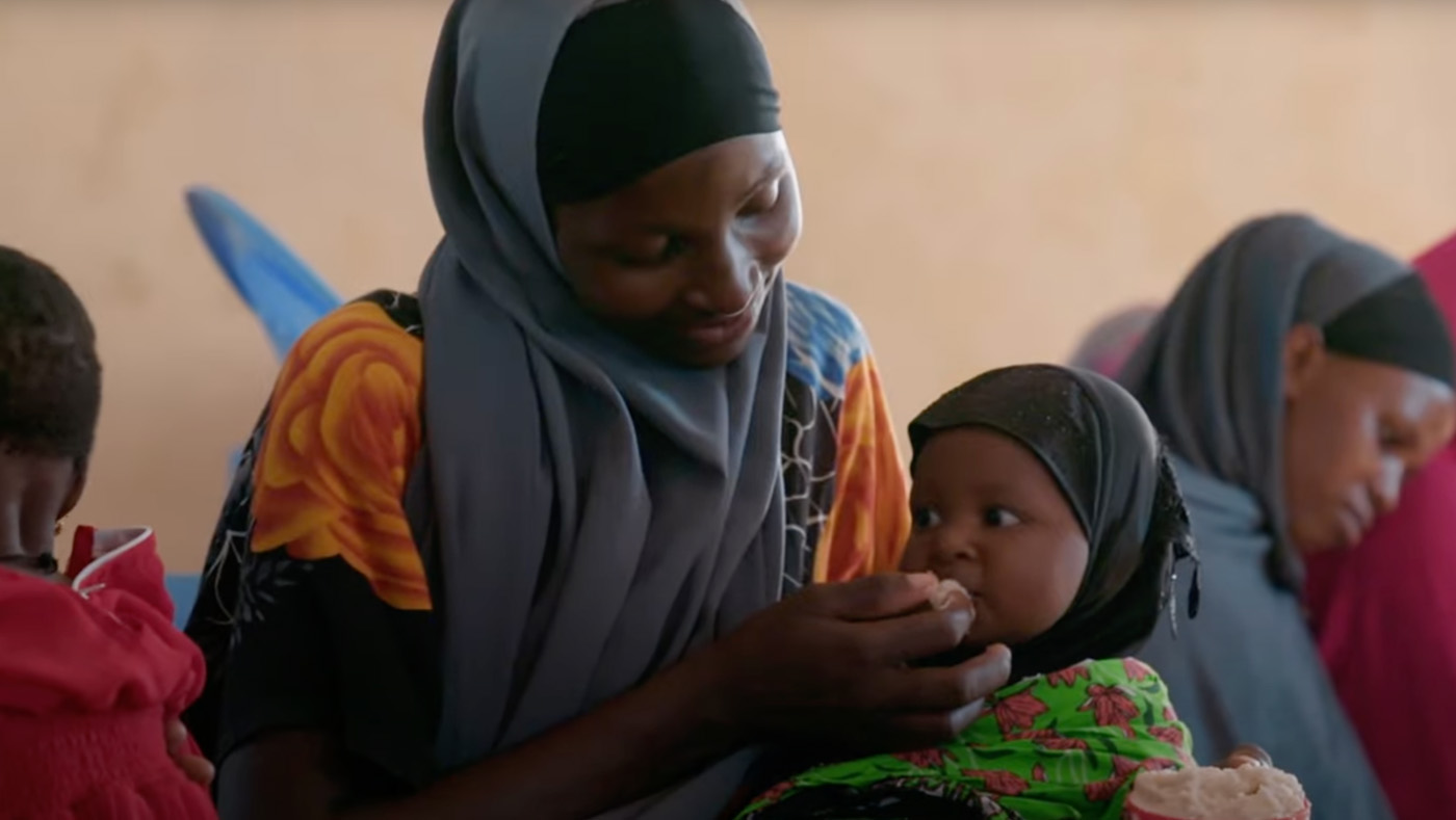
Curbing malnutrition with AI
Amref is working with the University of Southern California (USC), the Kenyan Ministry of Health, and Microsoft AI for Good Lab to develop a model that predicts health risks with AI. Each partner institution contributed their expertise to develop a solution that will empower government and humanitarian groups to tackle community health in a new way.
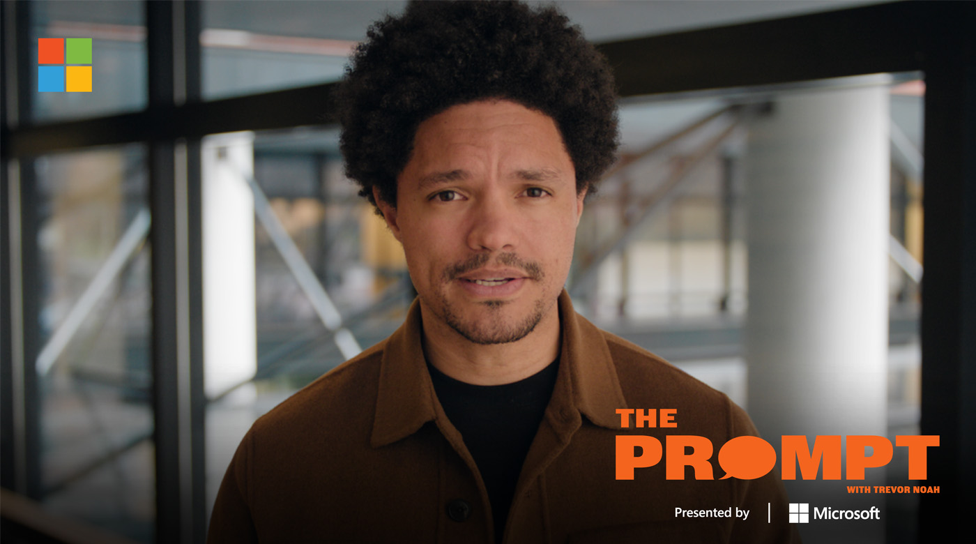
The Prompt with Trevor Noah
Join Trevor Noah in a thought-provoking series that delves into the world of Artificial Intelligence (AI) alongside our AI for Good Lab partners. Each episode explores fundamental questions at the heart of AI’s global impact. From shaping public safety, to health and education, the series takes viewers to the forefront of technological advancements, engaging with technologists, engineers, and scientists.
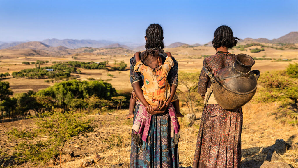
Identifying vulnerable communities at risk
The AI for Good Lab and IOM use AI and climate data to identify vulnerable communities at risk from extreme heat, flooding, and sea level rise. Pilot projects in Libya, Ethiopia, and the Maldives uncovered insights that empower organizations to anticipate risks, improve resilience, and develop proactive strategies that can be scaled globally.
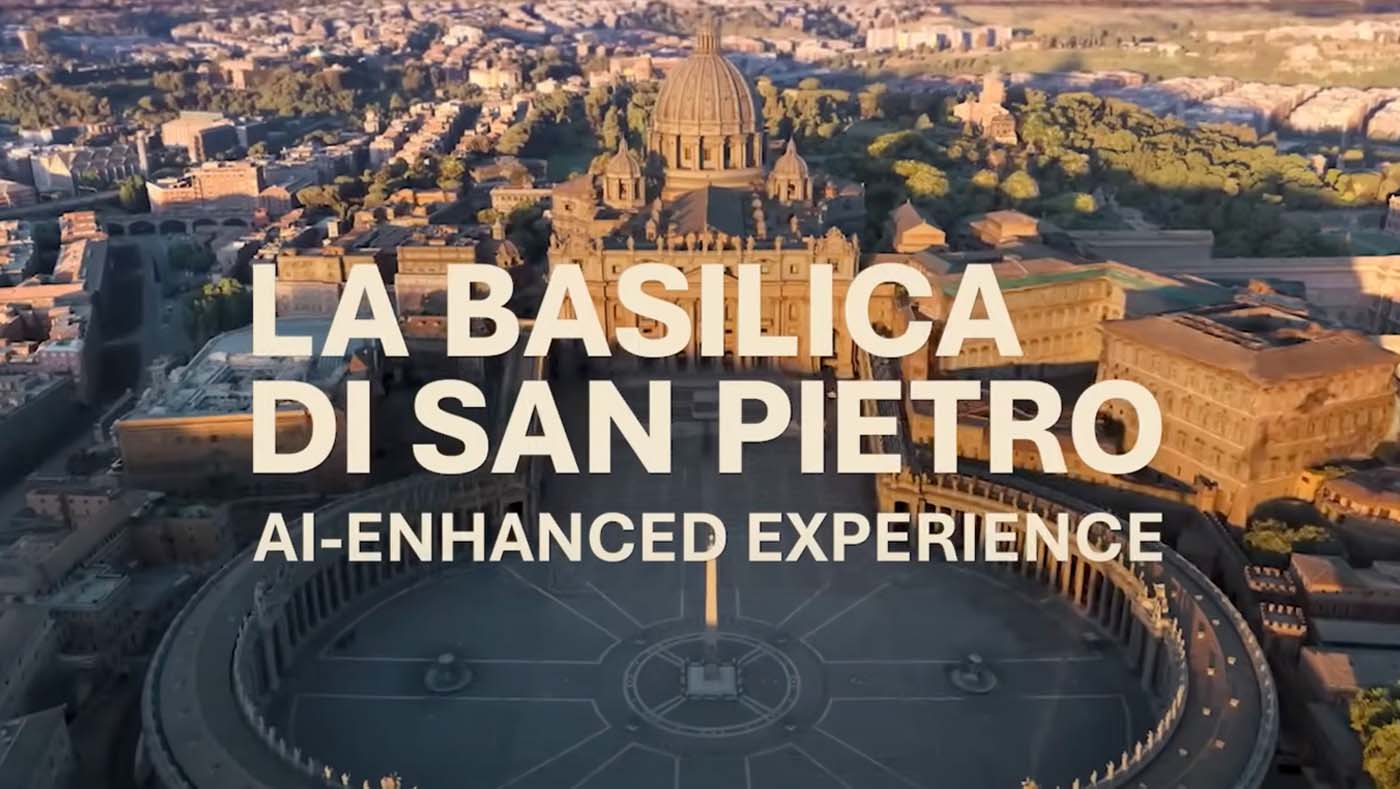
Making cultural heritage more accessible
Photogrammetry, AI, and digital preservation combine to create a digital twin of St. Peter’s Basilica using thousands of images, enabling people to explore it in detail from anywhere in the world. AI detected cracks and missing mosaic tiles, helping to ensure the preservation of the Basilica as a cultural, spiritual, and historically significant site for years to come.


